


Labelled:
Horizontal and labelled:
Coordinated switches:
As an input element:
Welcome. Browse the Web UI Framework components and learn how to make rich, accessible, touch-friendly apps.
You can test-drive the page switcher widget by clicking (i.e. pressing and immediately releasing) the Ctrl key.
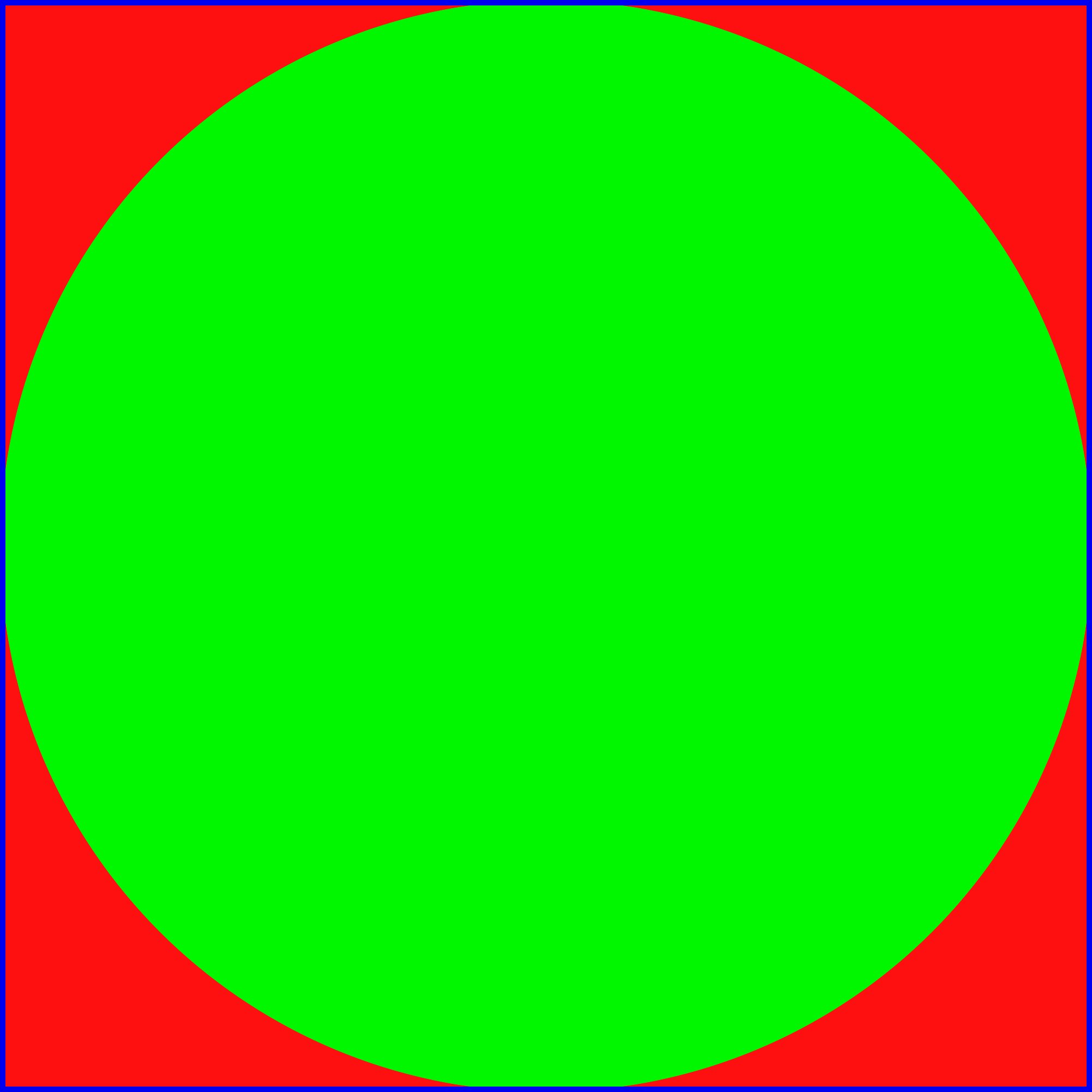
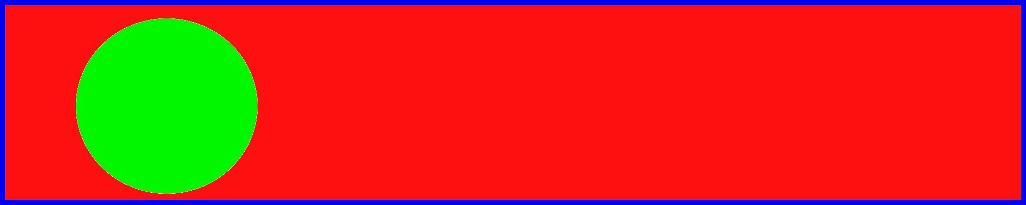
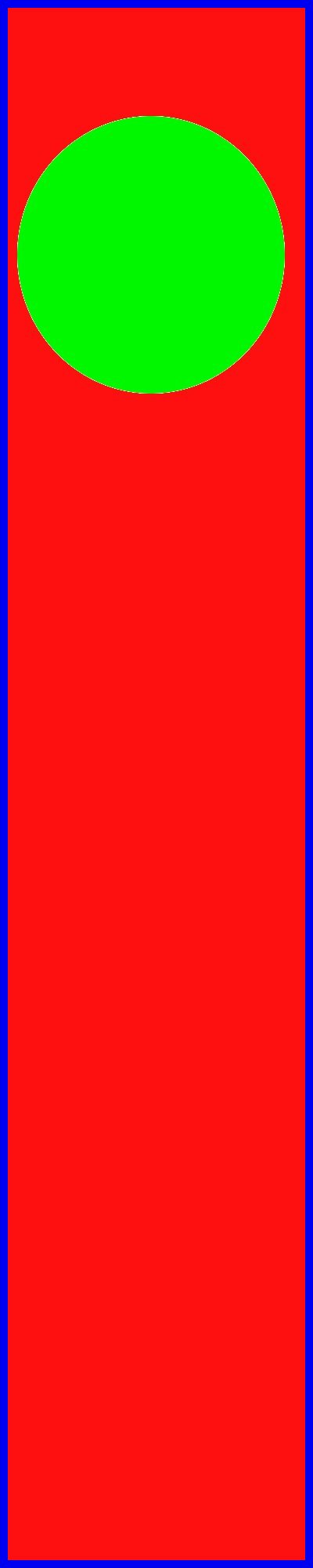
Single Image Display reduces or enlarges images so that they fit their container while maintaining their aspect ratio. The container might be another element, or the window itself.
The date you selected is: (select a date first)
The day(s) you selected are: (select a day first)
Note that the checkboxes are visible as icons (this is the default behaviour for vertical checkbox controlgroups in jQuery Mobile).
Labelled:
Horizontal and labelled:
Coordinated switches:
As an input element:
Popup windows appear above the normal UI and contain a small number of UI elements.
Popup list| Mary | had-a | little | lamb |
| and-it | was | white-as | snow |
| and-everywhere | that | Mary | went |
| her-lamb | was-sure | to | go |
Popup windows will follow the theme of the button to which they are associated, unless the theme is explicitly set.
Show popup Show popup Show popup Explicitly themed| Eenie | Meenie | Mynie | Mo |
| Catch-a | Tiger | By-the | Toe |
| If-he | Hollers | Let-him | Go |
| Eenie | Meenie | Mynie | Mo |
Normal page elements (such as the login form below) can be converted to popups and can then be restored. Convert to popup
Popup windows can have various transitions: Choose transition
This is a regular page, styled as a dialog. To create a dialog, just link to a normal page and include a transition and data-rel="dialog" attribute.
| Sounds good | Cancel |
I am processing
I am processing
A list of names in a short container with all default options.
<ul data-scroll="y">
    <li>...</li>
</ul>
A list of names in a longer scrollview, again by using 'data-scroll="y"' with the <ul> element.
Use of css to control the width, height and border is shown in demo.css.
Use of javascript to set options is shown in init.js. The button will toggle scrollbar visibility (initially hidden in demo.css) using the label's click event to set the css visibility attribute (see init.js).
The scrollview's scrollDuration is set to 10000ms (default is 2000ms) so the scroll takes 10 seconds to finish.
/* in demo.css */
#scroller2 .ui-scrollview-clip {
    height: 300px; /* container height */
    border: 1px solid #155678;
}

/*
 * set the width of the content
 * else the checkbox will extend to the right edge
 */
#scroller2Content {
    width: 205px;
}

/* hide scroll bar from #scroller2 element */
#scroller2 .ui-scrollbar {
    visibility: hidden; /* bound to checkbox in init.js */
}

/* in init.js
 * many options cannot be set without subclassing since they're
 * used in the _create method - it seems as if these are for
 * internal use only and scrollDuration is only changable by
 * chance.
 */
var $scroller2List = $('#scroller2').find('ul');
$scroller2List.scrollview('option','scrollDuration','10000');
This example shows a horizontally scrolling list, done by setting the 'data-scroll' attribute of the <ul> element to 'x'. All other options are default.
<ul data-scroll="x" >
    <li>....</li>
</ul>
This example shows the list of names in short container with paging.
This is done by setting the 'data-scroll' attribute of the <ul> element to 'yp'. All other options are default.
If you scrolling up/down a small amount you can see the paging effect.
Notice how the names scroll up/down by one height of its container (keep your eye on what the names are at the top/bottom of the container).
<ul data-scroll="yp" >
    <li>....</li>
</ul>
This example show the list on names horizontally with page scrolling (see above).
<ul data-scroll="xp" >
    <li>....</li>
</ul>
More optionheader demos...
2 buttons 3 buttons 4 buttons 8 buttons 2 seg + function 2 buttons, inline Programmatic
NB this option header starts in a collapsed state.
Some content would be here
Some content would be here
NB to get the scrollview to work inside the personpicker, the following style is applied to automatically shorten the scrollview clip div:
/* short-person-picker is the ID of the div used to create the personpicker */
#short-person-picker .ui-scrollview-clip {
    height: 400px;
}
This should get auto-dividers based on link text.
This should get auto-dividers based on link text but shouldn't produce duplicate dividers on refresh. Should also add more dividers if new list elements are added.
This uses a custom selector to draw text from formatted list items.
This should get auto-dividers based on text. NB this has intentionally blank li elements to check they don't get dividers.
Non-sorted list will produce duplicate auto-dividers.
This had dividers already which were replaced.
Here's an example with 10px hgap, scrolling on, but scrollbars off (set
with data-layout-options='{"hgap":10, "scrollable":true,
"showScrollBars":false}').
Each of the divs laid out by this hbox has a size 400px x 400px, set via CSS.
Each of the divs laid out by this hbox has a size 400px x 400px, set via CSS.
Each of the divs laid out by this hbox has a size 400px x 400px, set via CSS.
Each of the divs laid out by this hbox has a size 400px x 400px, set via CSS.
Each of the divs laid out by this hbox has a size 400px x 400px, set via CSS.
Each of the divs laid out by this hbox has a size 400px x 400px, set via CSS.
Each of the divs laid out by this hbox has a size 400px x 400px, set via CSS.
Each of the divs laid out by this hbox has a size 400px x 400px, set via CSS.
Here's an example with 2px hgap and scrollable off (set
with data-layout-options='{"hgap":2, "scrollable":false}').
tiny tiny tiny tiny tiny tiny
tiny tiny tiny tiny tiny tiny
tiny tiny tiny tiny tiny tiny
tiny tiny tiny tiny tiny tiny
tiny tiny tiny tiny tiny tiny
tiny tiny tiny tiny tiny tiny
tiny tiny tiny tiny tiny tiny
tiny tiny tiny tiny tiny tiny
Here's an example with 2px hgap and scrollable off (set
with data-layout-options='{"hgap":2, "scrollable":false}').
Notice that layouting can be dynamically applied as children are
added by calling $(<container>).layouthbox('refresh').
Note that children will be clipped as they move out of the end
of the container (no scrollview is applied in this case).
Add element at start Add element at end Reset
tiny tiny tiny tiny tiny tiny
Here is an example similar to the above, but with a scrollview.
Add element at start Add element at end Reset Increase hgap Decrease hgap Scrollbars off
bigger bigger bigger bigger bigger
Each of the divs laid out by this hbox has a
size 300px x 300px, set via CSS. Horizontal gap is
configured using data-layout-options='{"hgap":10}'. Note
that the content area loses its padding, so you might want to
use a div inside the content area.
Each of the divs laid out by this hbox has a
size 300px x 300px, set via CSS. Horizontal gap is
configured using data-layout-options='{"hgap":10}'. Note
that the content area loses its padding, so you might want to
use a div inside the content area.
Each of the divs laid out by this hbox has a
size 300px x 300px, set via CSS. Horizontal gap is
configured using data-layout-options='{"hgap":10}'. Note
that the content area loses its padding, so you might want to
use a div inside the content area.
Each of the divs laid out by this hbox has a
size 300px x 300px, set via CSS. Horizontal gap is
configured using data-layout-options='{"hgap":10}'. Note
that the content area loses its padding, so you might want to
use a div inside the content area.
Each of the divs laid out by this hbox has a
size 300px x 300px, set via CSS. Horizontal gap is
configured using data-layout-options='{"hgap":10}'. Note
that the content area loses its padding, so you might want to
use a div inside the content area.
Each of the divs laid out by this hbox has a
size 300px x 300px, set via CSS. Horizontal gap is
configured using data-layout-options='{"hgap":10}'. Note
that the content area loses its padding, so you might want to
use a div inside the content area.
Each of the divs laid out by this hbox has a
size 300px x 300px, set via CSS. Horizontal gap is
configured using data-layout-options='{"hgap":10}'. Note
that the content area loses its padding, so you might want to
use a div inside the content area.
Each of the divs laid out by this hbox has a
size 300px x 300px, set via CSS. Horizontal gap is
configured using data-layout-options='{"hgap":10}'. Note
that the content area loses its padding, so you might want to
use a div inside the content area.
Each of the divs laid out by this hbox has a
size 300px x 300px, set via CSS. Horizontal gap is
configured using data-layout-options='{"hgap":10}'. Note
that the content area loses its padding, so you might want to
use a div inside the content area.
Here's an example with 10px vgap, scrolling on, but scrollbars off (set
with data-layout-options='{"vgap":10, "scrollable":true,
"showScrollBars":false}').
Each of the divs laid out by this vbox has a size 400px x 400px, set via CSS.
Each of the divs laid out by this vbox has a size 400px x 400px, set via CSS.
Each of the divs laid out by this vbox has a size 400px x 400px, set via CSS.
Each of the divs laid out by this vbox has a size 400px x 400px, set via CSS.
Each of the divs laid out by this vbox has a size 400px x 400px, set via CSS.
Each of the divs laid out by this vbox has a size 400px x 400px, set via CSS.
Each of the divs laid out by this vbox has a size 400px x 400px, set via CSS.
Each of the divs laid out by this vbox has a size 400px x 400px, set via CSS.
Here's an example with 2px vgap and scrollable off (set
with data-layout-options='{"vgap":2, "scrollable":false}').
Note that even though the outer div has its height set to 600px,
because it doesn't have a scrollview, the div is sized so
its children fit vertically (this is a jLayout "feature").
tiny tiny tiny tiny tiny tiny
tiny tiny tiny tiny tiny tiny
tiny tiny tiny tiny tiny tiny
tiny tiny tiny tiny tiny tiny
tiny tiny tiny tiny tiny tiny
tiny tiny tiny tiny tiny tiny
tiny tiny tiny tiny tiny tiny
tiny tiny tiny tiny tiny tiny
Here's an example with 2px vgap and scrollable off (set
with data-layout-options='{"vgap":2, "scrollable":false}').
Notice that layouting can be dynamically applied as children are
added by calling $(<container>).layoutvbox('refresh').
Note that children are not clipped, as the container
will grow to accommodate them (unlike the horizontal layout
box, which is constrained by jqm to only ever be as wide as the
page).
Add element at start Add element at end Reset
tiny tiny tiny tiny tiny tiny
Here is an example similar to the above, but with a scrollview.
Add element at start Add element at end Reset Increase vgap Decrease vgap Scrollbars off
bigger bigger bigger bigger bigger
Each of the divs laid out by this vbox has a
size 300px x 300px, set via CSS. Vertical gap is
configured using data-layout-options='{"vgap":10}'. Note
that the content area loses its padding, so you might want to
use a div inside the content area.
Each of the divs laid out by this vbox has a
size 300px x 300px, set via CSS. Vertical gap is
configured using data-layout-options='{"vgap":10}'. Note
that the content area loses its padding, so you might want to
use a div inside the content area.
Each of the divs laid out by this vbox has a
size 300px x 300px, set via CSS. Vertical gap is
configured using data-layout-options='{"vgap":10}'. Note
that the content area loses its padding, so you might want to
use a div inside the content area.
Each of the divs laid out by this vbox has a
size 300px x 300px, set via CSS. Vertical gap is
configured using data-layout-options='{"vgap":10}'. Note
that the content area loses its padding, so you might want to
use a div inside the content area.
Each of the divs laid out by this vbox has a
size 300px x 300px, set via CSS. Vertical gap is
configured using data-layout-options='{"vgap":10}'. Note
that the content area loses its padding, so you might want to
use a div inside the content area.
Each of the divs laid out by this vbox has a
size 300px x 300px, set via CSS. Vertical gap is
configured using data-layout-options='{"vgap":10}'. Note
that the content area loses its padding, so you might want to
use a div inside the content area.
Each of the divs laid out by this vbox has a
size 300px x 300px, set via CSS. Vertical gap is
configured using data-layout-options='{"vgap":10}'. Note
that the content area loses its padding, so you might want to
use a div inside the content area.
Each of the divs laid out by this vbox has a
size 300px x 300px, set via CSS. Vertical gap is
configured using data-layout-options='{"vgap":10}'. Note
that the content area loses its padding, so you might want to
use a div inside the content area.
Each of the divs laid out by this vbox has a
size 300px x 300px, set via CSS. Vertical gap is
configured using data-layout-options='{"vgap":10}'. Note
that the content area loses its padding, so you might want to
use a div inside the content area.
You can put anything you want in an expandable